The page builder — overview & blocks
Every block type you can drop onto an invite page, and what each one actually renders.
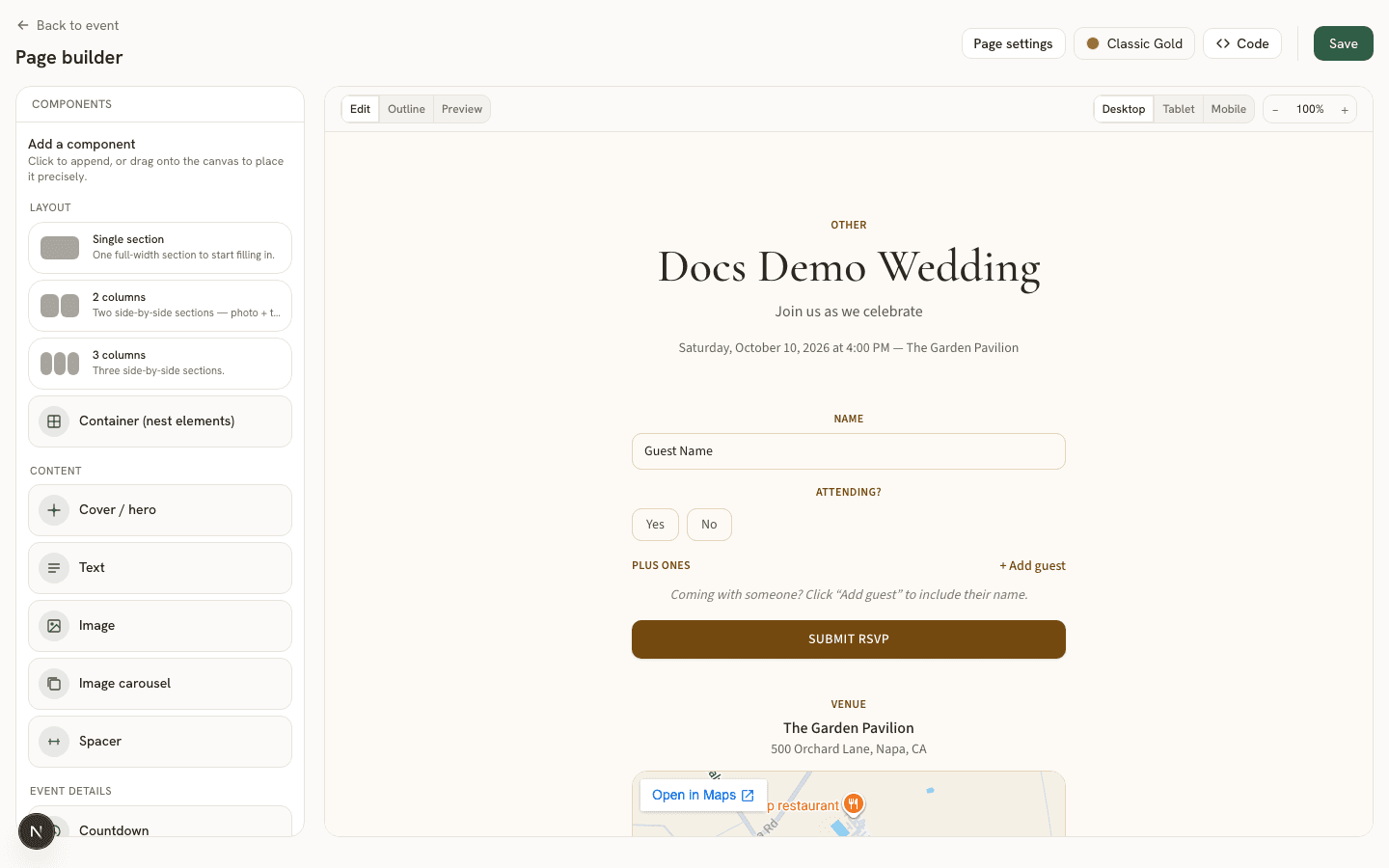
Every event has its own invite page, built from a list of blocks— a hero, text, an RSVP form, and so on. Open it from the event’s Invite page tab: the left panel is the component palette, the middle is a live canvas of the page as guests will see it, and clicking any block opens its own Properties Panel on the right.
Adding, moving, and removing blocks
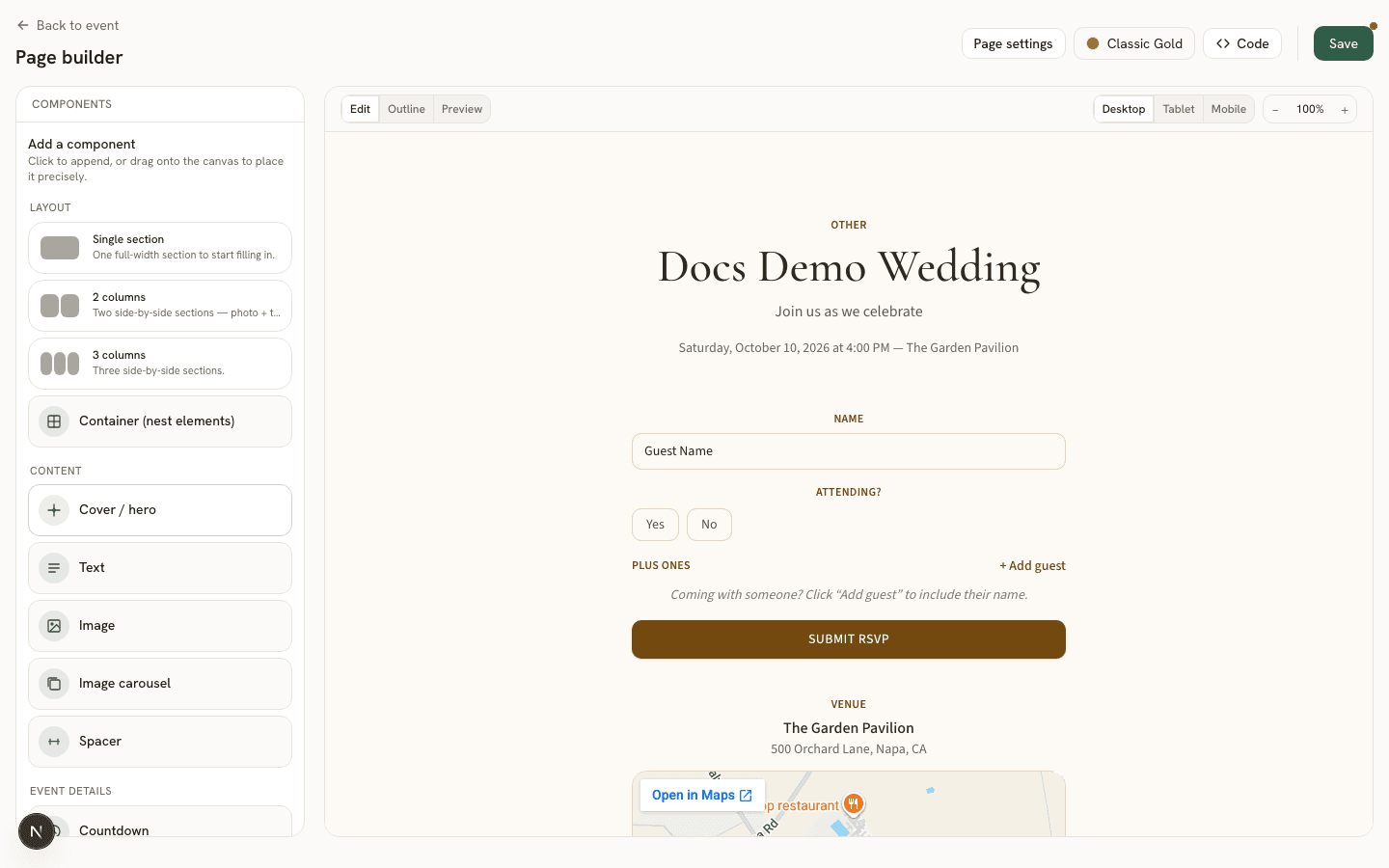
Every palette card works two ways: click it to append that block to the end of the page, or drag it onto the canvas to drop it at a precise spot — including directly onto a container to nest it inside. Existing blocks on the canvas can be dragged the same way to reorder them. Select a block to see its Properties Panel; every panel follows the same shape — content fields at the top, layout and styling controls further down (see layout controls and styling).
Starter layouts
The palette’s Layout section offers three one-click starting points: Single section (one full-width container), 2 columns, and 3 columns(a grid container holding two or three empty containers side by side). Each is just a pre-built container tree, not a locked template — once it’s on the page, every piece of it (the outer grid, each nested container, anything you drop inside) is a completely ordinary block you can edit, rearrange, or delete like any other.
Blocks
Each block type has its own page below with every configurable field and a screenshot showing its Properties Panel next to a live Preview of the result:
Cover / hero
The banner at the top of the page.
Text
A block of your own copy.
Image
A single photo.
Image carousel
A slideshow of multiple photos.
Spacer
Invisible vertical space.
Countdown
A live countdown to the event.
Schedule / itinerary
A run-of-show list.
RSVP form
The form guests respond with.
Form
Embeds one of your saved custom forms.
Venue map
An embedded map for the venue.
Custom HTML/CSS/JS
Your own markup, in a sandbox.
Container
A box that holds other blocks.
Device preview and the raw JSON escape hatch
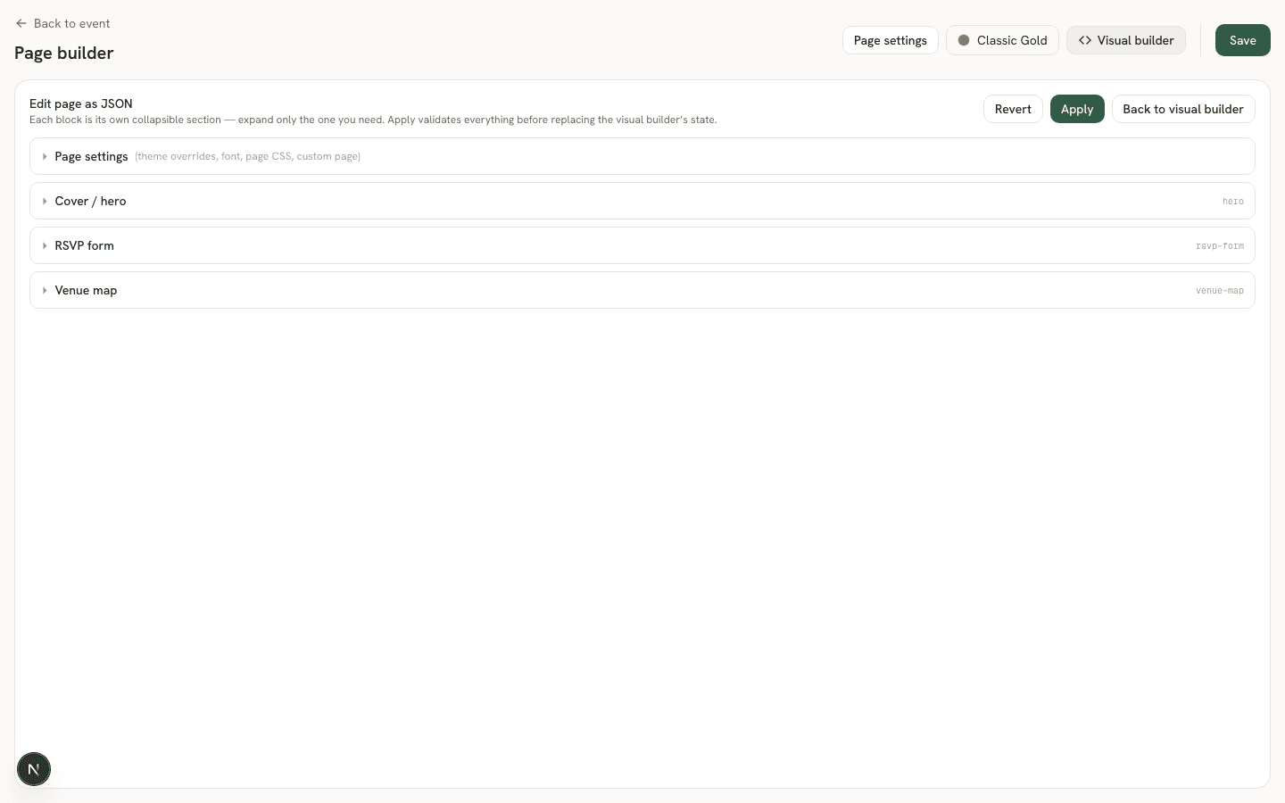
A Desktop/Tablet/Mobile toggle in the toolbar re-renders the canvas at each device’s real width, so you can check a layout before publishing without leaving the builder. For anything the visual builder doesn’t expose a knob for, the Code button swaps the canvas for the page’s underlying JSON schema — the same data the visual builder edits, as text. It’s a manual round-trip, not a live sync: edits stay local until you click Apply (or Revert to discard them), and it’s a power-user fallback, not a required step — everything described above is reachable without ever opening it.